タイポグラフィは、見た目と機能の両方に影響を与えるトランプデザインの重要な要素である。標準的なデッキでは、読みやすさを最大化し、カードのビジュアル・アイデンティティをサポートするために選択された書体が使用される。この記事では、トランプで一般的に使用されるフォントを検証し、なぜフォント選択が重要なのかを説明し、WellCardsのようなメーカーがどのようにタイポグラフィをクライアントに適応させているかを概説します。また、典型的なフォントスタイル、カスタマイズのワークフロー、カードデザインにおけるタイポグラフィの実際的な影響についても検証する。.
活字がビジュアルコミュニケーションにどのような影響を与えるかを理解するには、タイポグラフィの基本原則を明確に把握する必要がある。.
タイポグラフィ・デザインの原則を探る
Playing with Typeの意図は、タイポグラフィについてこれまでとは違った考え方をするように仕向けることである。タイポグラフィは、活字の原則を強制するものであると同時に、活字を新たな領域へと押し進めるものでもある。.
活字で遊ぶ:タイポグラフィ・デザインの原理を探るための50のグラフィック実験, 2013
一般的なトランプに使われているフォントは?
一般的なトランプは、読みやすさと歴史的な関連性から選ばれた書体を使用している。この書体の選択は、プレー中の明瞭さと、カジュアルな環境にも競技環境にも適した一貫した視覚的言語を好む。.
WellCardsからカスタムスタンダードトランプの見積もりを取る
トランプの表面の典型的なフォントのスタイルとは?
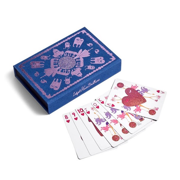
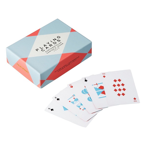
カード・フェイスには一般的にセリフ体とサンセリフ体の両方が使われている。Caslonのようなセリフ体には小さな終端ストロークがあり、遠くからでも認識しやすい。Futuraのようなサンセリフ体は、よりクリーンで現代的な印象を与える。選択は用途とデッキの美的目標による。.
CaslonやFuturaのようなフォントはカードデザインにどう影響するか?
CaslonやFuturaといった書体は、デッキの個性と使いやすさを形作る。Caslonの伝統的なセリフ体のフォルムは格式と伝統を伝え、Futuraの幾何学的な形は現代性を伝える。フォントの選択は読みやすさに影響し、ブランディングや市場でのポジショニングに貢献する。.
WellCardsはどのように標準デッキのフォントをカスタマイズしますか?
WellCardsは標準的なトランプカードの制作を専門とし、タイポグラフィがクライアントのブランドやデザイン要件に沿うよう、フォントのカスタマイズオプションを提供している。.
WellCardsはどのような印刷方法でフォントを鮮明にしていますか?
WellCardsは、フォントの鮮明さを保証するために確立された印刷技術を使用しています。オフセット印刷は大量の印刷でも安定した仕上がりを実現し、デジタル印刷は少量のカスタマイズ注文にも柔軟に対応します。どちらのアプローチも、生産量にかかわらず、シャープで読みやすいテキストを維持するのに役立ちます。.
カードデッキにカスタムフォントをリクエストするには?
顧客は定義されたデザイン・プロセスを通じてカスタム・フォントを要求する。クライアントはデザインチームと相談して要件を指定し、プルーフを確認して外観を確認し、最終的な制作の前に調整を依頼します。このワークフローにより、クライアントは完成したデッキに満足することができます。.
トランプデザインにおいてフォント選択が重要な理由とは?
フォントの選択は、読みやすさと視覚的な魅力の両方にとって基本的なものです。適切な書体は、ゲームプレイ中に数値やスーツを読みやすくすることで、プレイヤーの体験を向上させます。.
WellCardsからカスタムスタンダードトランプの見積もりを取る
タイポグラフィはカードの読みやすさと美しさにどう影響するか?
タイポグラフィは、プレイヤーがスートとバリューを識別する速さに影響する。装飾的な書体は認識を鈍らせるが、シンプルで大胆な書体は明瞭さを向上させる。また、フォントの美しさもデッキの魅力に影響する。.
フォントの品質を保証する業界標準と認証とは?
カードの組版に関する業界標準は、読みやすさと耐久性に重点を置いています。品質管理は、最終製品がメーカーと消費者の期待に応えられるよう、フォントの明瞭さと印刷全体の一貫性を確認するのが一般的です。.
標準的なトランプのフォントは?
トランプのフォントを選ぶとき、どのような要素を考慮すべきでしょうか?
フォントを選ぶ際は、読みやすさ、文体への適合性、想定する読者を考慮する。書体は一般的な閲覧距離でも読みやすくなければなりません。サイズと太さは明瞭さのために重要であり、美的感覚はデッキのテーマをサポートするものでなければなりません。選択したフォントは、機能的な役割を果たしながら、デザインを向上させるものでなければならない。.
異なる文化はトランプのタイポグラフィにどのような影響を与えるのか?
文化的嗜好がタイポグラフィの選択を形作る。その土地の芸術の伝統を反映した華麗で装飾的なフォルムを好む市場もあれば、最小限の可読性の高いデザインを好む市場もある。また、文化的なシンボルやモチーフもタイポグラフィに影響を与える。デザイナーはこうしたニュアンスを意識することで、ターゲットとする地域に響くデッキを制作することができる。.
トランプのタイポグラフィにおいて、色はどのような役割を果たしているのだろうか?
色は読みやすさと知覚の両方に影響する。例えば白地に黒のようなコントラストの高い組み合わせは、様々な照明の下でも読みやすさを向上させます。また、色彩はデッキのテーマをサポートし、華やかなデザインには明るいパレットを、クラシックなデッキには落ち着いた色調を用い、全体的な機能性にも貢献します。.
現在、トランプのタイポグラフィに何かトレンドはありますか?
現在のトレンドには、ブランドのアイデンティティを強化する特注の手描き書体や、明快さを優先するミニマルなデザインが引き続き好まれている。タイポグラフィを指定する際には、持続可能な素材や印刷方法も考慮されるようになっている。.
タイポグラフィはゲーム体験にどのような影響を与えるのか?
タイポグラフィは、プレーヤーがカード情報をいかに早く解釈するかに影響する。明瞭で読みやすいタイポグラフィは、スートとバリューを素早く認識することを可能にし、これは速いプレイに不可欠である。逆に、複雑すぎるタイポグラフィはスピードの妨げとなり、混乱を招き、プレイの質を低下させる。.
トランプのタイポグラフィで避けるべき一般的な間違いとは?
よくある誤りには、読みやすさを損なうような複雑すぎる活字を選んだり、コントラストが不十分な色の組み合わせを選んだりすることがある。適切なサイズやウェイトを無視することも明瞭さを損なう。乱雑さを避け、タイポグラフィを機能的に保つことが、効果的なデザインの鍵となる。.
標準的なトランプ・フォントは商標登録されていますか?
標準的なトランプの書体は、一般に広く使用することができる。しかし、特注のデザインやブランドのために開発された独自のスタイルの書体は、商標や著作権保護の対象となり、無許可での使用が制限される場合がある。.
カスタム・フォントはトランプのブランド・アイデンティティを強化できるか?
カスタムタイプは、トランプのブランドアイデンティティを強化することができます。個性的なタイポグラフィはブランドを際立たせ、認知度を高めると同時に、製品に配慮された視覚的要素を加えます。.
ご注文に関するご質問やサポートが必要な場合は、以下をご利用ください。 お問い合わせ .
結論
トランプのタイポグラフィーを考慮したアプローチは、使いやすさと見た目の両方を向上させる。適切な書体は読みやすさを高め、デッキの美観をサポートする。WellCardsのようなプロバイダーが提供するカスタマイズ・オプションを利用すれば、ブランドは自社のデザイン目標やユーザー・ニーズに沿った個性的なデッキを作ることができる。.